I still remember my Agong (the Taiwanese word for grandpa) holding my six year old hand guiding me to the room that my parents had always forbid my brother and me to go into. “It’s Agong’s special room…respect his privacy,” they would say. “I bet it’s a secret wardrobe that opens the doors into some alternate world,” my older brother suggested after we watched Narnia. After all the theories were laid out, I was finally able to see what my brother and I had been speculating for years. There was no secret wardrobe but inside the room was something much better. As my grandfather allowed me inside, I saw at least 50 canvases and sculptures filled the room. The art was like a maze- suffocating, yet so beautiful.
I let go of my Agong’s hand and gravitated over to the streams of colors that was curated by George Chan. I ran my fingers along the brushed-gold Parisian frame. Perhaps I walked over because the bright colors reminded me of my crayons, but my Agong remains convinced that even at an early age, I already had an appreciation for modernist art. And he was not wrong.
George Chann, though his name is not as prevalent as other modernist artists such as Pollock, has a different back story. Chann emigrated to the United States when he was 19 years old. He was born in China in 1913. Having spoken broken English, Chann spent his days in an art studio in solitude. However his isolation and lack of English ability did not prohibit his art career. In 1933, he began studying at the Otis Art Institute in Los Angeles, California. Right after his graduation, Chan began his teaching at the same school and exhibiting his works.
Agong showed me two of his works. One prior to the 1950’s and one after. At the time I had no concept of time, so in simple terms he told me one was older than the other. Even at the age of six, I knew that time was not the only factor that separated the two pieces. The first one was of a landscape and the second was everything but.
The first painting was a coastal watercolor with muted greys, blues and blacks. The moon peeks through the dusty clouds with a subtle off white. It was a beautiful traditional work but it didn’t capture my attention at the time. However, my parents loved it and brought it back home with us to the states.
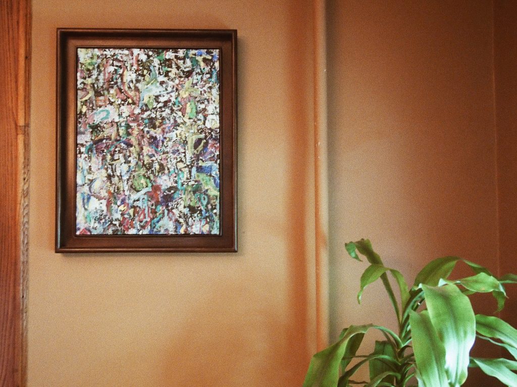
The pastel piece I was drawn to was much more chaotic and abstract. Streaks of color blessed the teal canvas. Each stroke was even broader and more opaque than the last. To an art amateur’s eyes, the painting is nothing more than slapping random colors on a sheet but to my Agong and me, each slap of color was intentional not arbitrary. Chan’s drastic transition from using soft mediums to the whole color spectrum signifies the powerful movement of modernism that swept through the 1950’s.
*****
For my 17th birthday, a month ago, I received a heavily-protected brown package. “To my modernist Mia. From: Agong” it read. I carefully tore the many layers of bubble wrap until I met the delicate frame that I recognized from over a decade ago. My fingers followed the ridges and swirls of the frame.
Now the pastel hangs proudly on my living room walls reminding me every day, that chaos can beautiful whether that is in art or in my life.
Amelia Chen
graphics chief
Graphic: Amelia Chen